So this, you get a little feeling for what AQUA may be like.
现在你们对AQUA可能的样子有了点感觉了。
So I'd like to just start off you know when you design a new user interface.
我想从设计一个新的用户界面开始。
You have to start off humbly,
你必须细致入微地开始,
you have to start off saying what are the simplest elements in it, what does a button look like.
你必须从最简单的元素开始,一个按钮是什么样子的开始。
And you spend months working on a button. That's a button in AQUA.
你花了几个月的时间做一个按钮。这是AQUA的一个按钮。
This is what radio buttons look like, simple things.
这是单选按钮的样子,很简单。
This is what check-boxes look like.
这是复选框的样子。
This is what pop-up lists look like.
这是下拉列表的样子。
Again, you starting to get the feel of this little difference.
同样地,你开始感觉到了这个小小的不同。
This is what sliders can look like, right?
这就是滑块的样子,对吧?

Now let me show you the Windows.
接下来我给各位展示一下窗口。
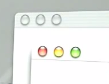
This is what the top of windows look like.
这是窗口顶部的样子。
These three buttons look like traffic signals, don't they?
这三个按钮看起来像交通信号,不是吗?
Red means close the window, yellow means minimize the window, and green means maximize the window. Pretty simple.
红色表示关闭窗口,黄色表示最小化窗口,绿色表示最大化窗口。很简单。
And tremendous fit and finish in this operating system.
这个操作系统在细节方面做了很多处理。
When you roll over these things you get those, you see them, you know.
当你滚动这些的时候,你会看到这样的效果。
And when you are not no longer the key window, you know, they go transparent, right?
而当不再是主窗口时,它们会变得透明。
So a lot of fit and finish in this.
所以在细节方面做得很好。
In addition to the fit and finish,
除了细节方面之外,
we paid a lot of attention to dynamics, not only how do things look, but how do they move, how do they behave.
我们花了很多精力在动态上,不仅仅是看起来如何,还有它们如何运动,它们如何表现。


