As you've probably heard by now, all 30 NBA teams unveiled new alternate uniforms.
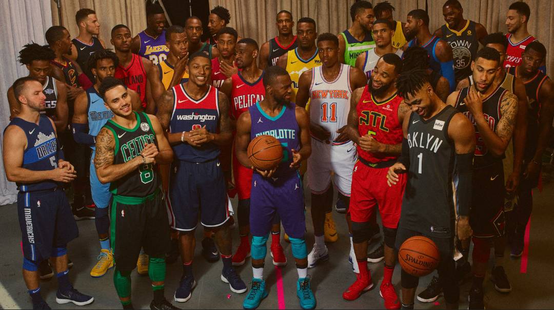
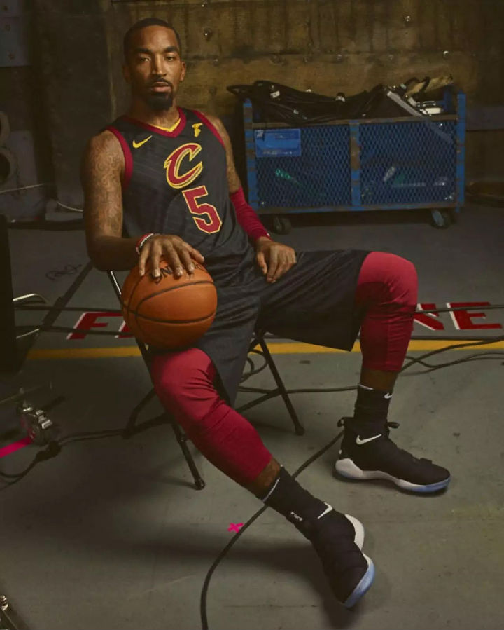
For example, teams such as Boston, Chicago and Cleveland chose black bases to convey a sense of strength and power.Each has team-specific detailing; Chicago's pays homage to its historic use of pinstripes, while Cleveland's displays the franchise's secondary logo.
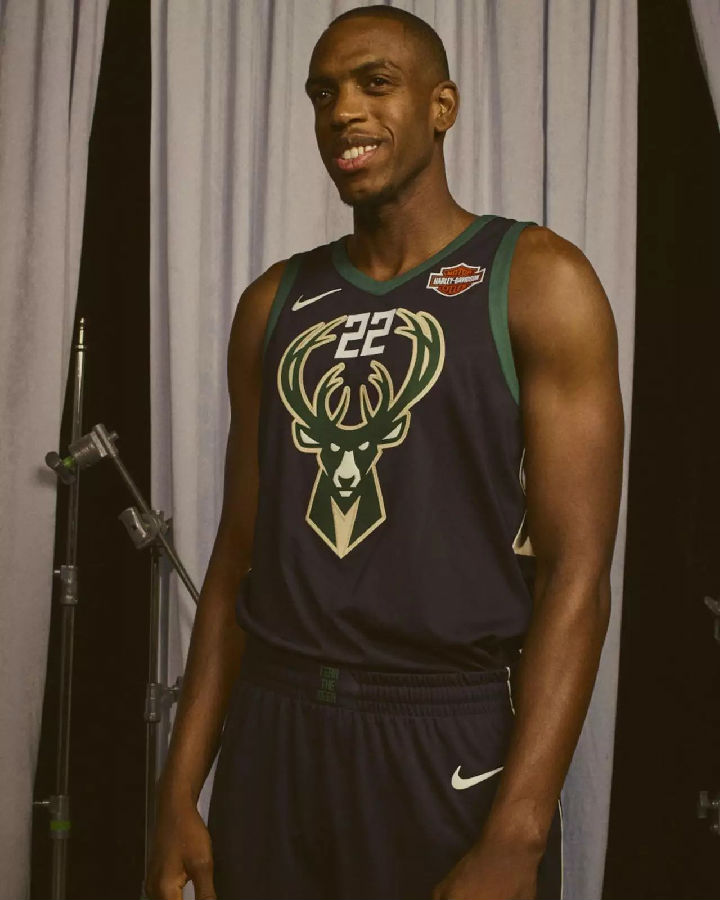
The latter conceit also follows in Milwaukee's Statement Edition uniform, where the team's powerful new Buck logo is front and center.
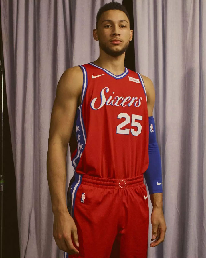
Meanwhile, plays on heritage are evident in Denver (where the city's famous mile-high altitude is viewed as an advantage) and Philadelphia (where the team's Sixers script is emblazoned in white).
Perhaps the strongest declaration is made by the champs, the Golden State Warriors, as the franchise pays respect to the culture and legacy of its hometown: Oakland.
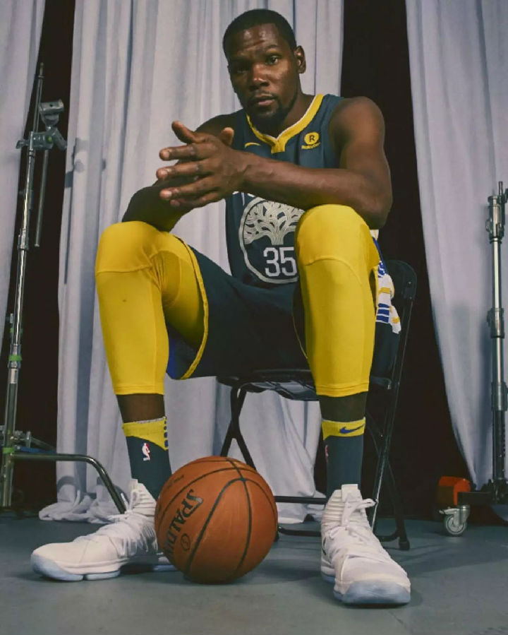
The design echoes the Warriors' classic "The City" design from decades past but swaps in "The Town" (which is the common term for Oakland, where the team currently plays).
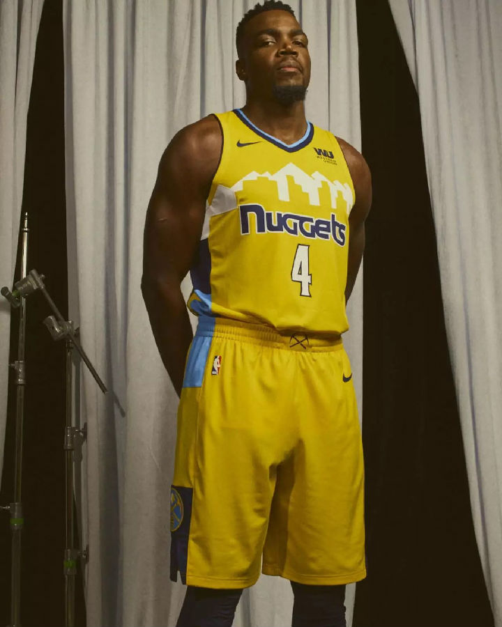
The team's new alternate, which retains the outline of the Denver skyline but scraps the rainbow striping, is a revelation. It looks so much cleaner, so much crisper, and the centered uniform number is a massive improvement as well.
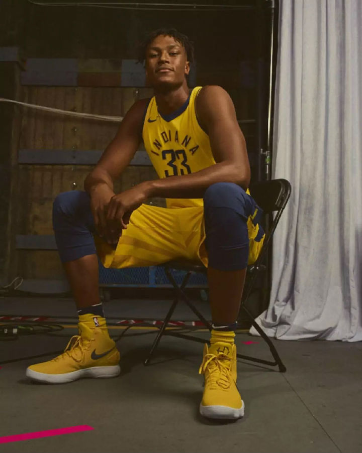
This one's pretty simple to assess: If you liked the new white and navy uniforms that the Pacers unveiled back in late July, you'll probably like this yellow version as well. Your friendly uniform columnist thinks the circular chest lettering looks great, and the yellow design is a good addition to what's shaping up as a very nice uniform set.
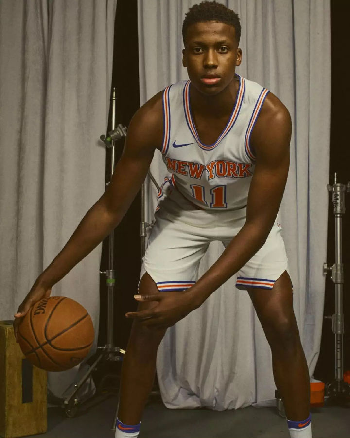
Out of the 30 newly released alternate uniforms, this is the only one that's white. If you're thinking it looks a lot like the Knicks' regular white uniform, you're right. But here's the thing: The alternate version is actually the superior design, particularly when you compare the trim on the collar, armholes, and waistband. Does it break new ground in basketball uniform design? Not even a little bit. But will it look good on the court? You betcha.
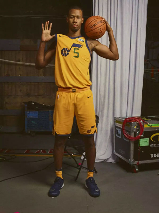
This one seems likely to provoke either a love or hate response in most fans. The minimalist design works really well, although it would rank higher on this list if they'd gone with navy or green instead of yellow.
更多精彩内容请关注微信公众号、新浪微博:篮球英文堂


